Epidemiology Modeling
Naomi Hardy-Njie, Zoe Jackson, Camille Lukash, Ariyanna Malbon, and Maryjane Okonji
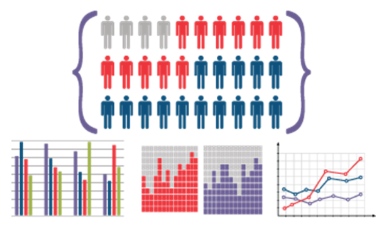
We first started off by learning the different parts of mathematical models. From there, we discussed what type of health status there could be when investigating a disease spread. We concluded that the different states could change, such as a healthy person can become infected, an infected person can die, and that an infected person can become cured.
Next, we learned dimensional analysis. Using this new found skill, we were able to make conversions from seconds, to minutes, then days, to years. We then used these conversions to determine data that helped us to further understand how the disease spread. Dimensional analysis enabled us to make predictions about the future of the disease including how many people would be infected and the amount of time it would take for the symptoms to take effect.
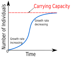
We then had to graph certain scenarios. We discussed the difference between linear and nonlinear graphs. For example, nonlinear logistical graphs have a carrying capacity, which helps us to see what would happen to certain populations if food or living space were to run out; while on the other hand, linear graphs have no carrying capacity and grow at a constant rate to infinity.
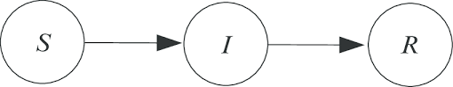
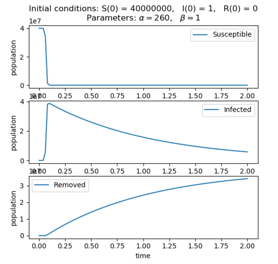
We then discussed how to make equations for each population (susceptible, infected, removed). We came up with values for each variable, with a=260, b=1, N=40,000,001, I= 1, S= 40,000,000, and R= 0. We plugged those values into one of the equations that was given. We also described how each population connects to another. The susceptible population eventually becomes infected and the infected population becomes recovered.
Eventually, we entered in the data from our specifically given scenario into our equations. We found that when using an SIR model, the susceptible population will only decline, the infected population sharply increased and then decreased, and the removed population only increased. These conditions were accounted for, assuming there were no births or outside population growth.
 Next we added in more constants, E and Q (exposed and quarantined), these new constants split SIR into more populations, and the new populations are SEIQR. The E and Q show specifically where civilians lie in between SIR. For example, a person can come in contact with an infected person but not show symptoms of the infection. They could either be not infected, or just not show symptoms yet. These people lie in the E population. The people who are very contagious with the infection and isolate themselves, lie in the Q population.